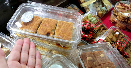
El-Sweetie is one fine place and an impressive example of ‘Visual Marketing’ at work!
With Small Business Marketing you tend to get people into one camp or another. That is, ‘Analytical’ type people or more of the ‘Creatives’ each with their own obvious strengths and weaknesses.
For me, I actually used to be more of a ‘Creative’ who became ‘Analytical’ who then has strived to meet a happy medium in my life today. I find the most effective entrepreneurs are a hybrid of both and it brings to me one important expression of ‘Creativity’ in Marketing – being that of visuals!
Being a man of proud Middle Eastern Heritage (as is expressed in my branding ‘The Crazy Persian’) I enjoy food from my culture (not all the time), but certainly have a massive sweet tooth and would eat that side of things 100% all day if there were not consequences of such behaviour.
On of my favourite Middle Eastern Sweet Houses that has won many awards and has acclaim across the whole of Sydney is ‘El-Sweetie’ in Granville. They offer a range of Lebanese, Persian and Middle Eastern Sweets which are just awesome.
Many of them I know from my childhood and I know exactly how they taste, but as my Arabic is incredibly lacking – I am often limited at point to it and saying “Oh my God, that is awesome – whatever is it”.
For my Sydney friends, I highly recommend you check it out and even make a special trip. It’s well worth it for an afternoon delight and even though it tastes divine, I am more wanting to hold it up as a great example of ‘Visual Marketing’.
That is, when you walk into the massive Cafe / Store / Sweet Bakery you are overloaded with beautiful pastries, colours, visuals, merchandising and packaging which just looks the part. Before you even consider tasting the foods, they visually look just amazing which does most of the sale for all.
It reminds me and inspires me of the fact of making your Product / Service / Marketing look the part. Be it great colours on your website, high quality business cards or even looking good yourself – it comes down to being one visually that people think are awesome which entices them to buy. I have found exactly that in particular on websites. If you don’t have the right imagery or wording, it just doesn’t wash.
You get this right, then it all happens and it’s just awesome.
My advice and lesson reminders from today? Make yourself and your business look just great! As you do, it makes everything much easier to buy and quite often you will notice an uptick in your sales as you improve things.
Love you work, thanks to El-Sweetie for the great work, stay awesome and bye for now from Ed.

No responses yet